Redesigning a HELOC offer so people stop guessing what they'll actually owe
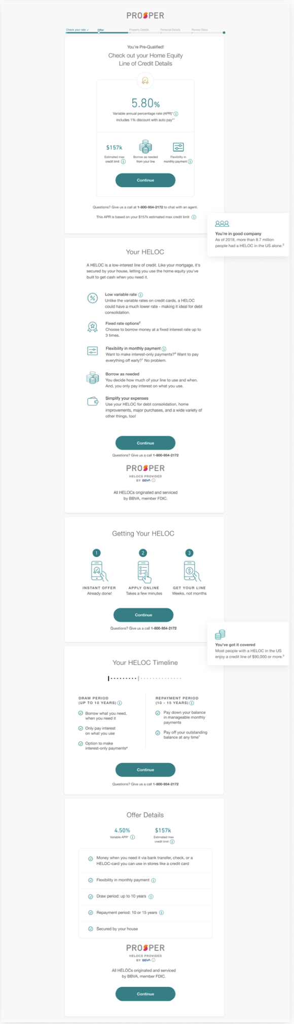
Prosper brought me on to consult on their design system, but the HELOC (Home Equity Line of Credit) offer page needed help, and I picked it up as a one-person workstream. Reviewing the existing page myself, I found that without prior knowledge of HELOCs, I wouldn't have felt confident enough in what was on the page to keep going with the application. Research backed that up — users found the page too long, repetitive, and confusing about repayment terms, and most didn't understand how a HELOC even differed from a regular loan.
Role: Sole designer on this workstream (design-system consulting engagement).
Access to: Prosper's in-house researcher and Creative Director for feedback.
Real constraints: no copywriter (I wrote and legal-reviewed the copy), no budget, existing components and visual system only
BEFORE
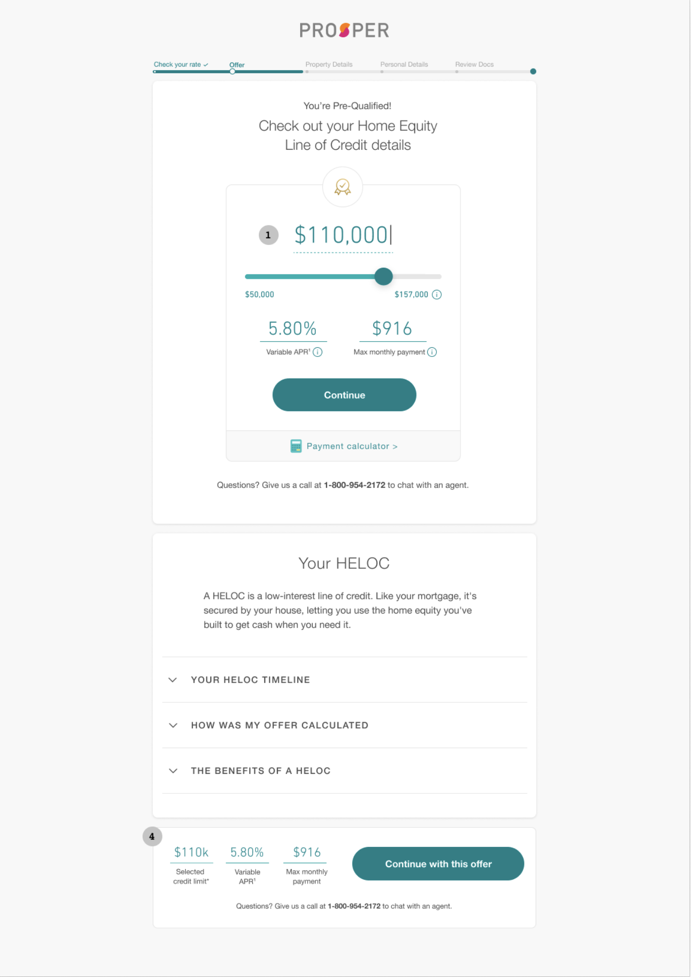
AFTER
What I changed
I cut the page from a stack of sections that repeated the same benefits three different ways down to one clear offer card, with everything else — timeline, benefits, "how was my offer calculated" — moved into collapsed accordions people could open only if they wanted more. Progressive disclosure instead of front-loading. I also brought the color palette up to WCAG 2 contrast requirements, a fix the existing page needed regardless of the redesign.
What testing told us
One usability session stuck with me. A test participant, an auto damage adjuster who'd owned his home 26 years and had it almost paid off, was using the HELOC to pay off credit cards. He put it plainly: "Money in my 401k is working for me. Money in my house isn't." That's the actual reasoning debt-consolidation applicants were bringing to this page, and it reframed how I thought about the offer — people weren't shopping for the lowest APR, they were trying to put idle equity to work.
The same round of testing also caught a real problem: people assumed the $110,000 shown was the maximum they had to borrow, not a ceiling they could adjust down. And they wanted to know their monthly payment based on what they'd actually draw, not the full line — which is what led to building a calculator that splits the estimate into draw-period (interest-only) and repayment-period (interest-and-principal) numbers, rather than one blended figure.
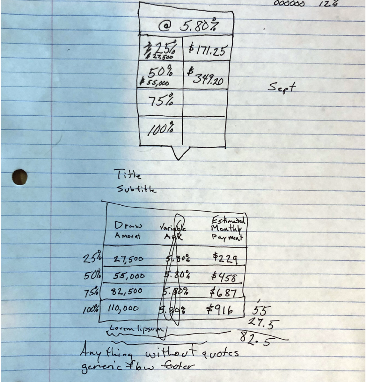
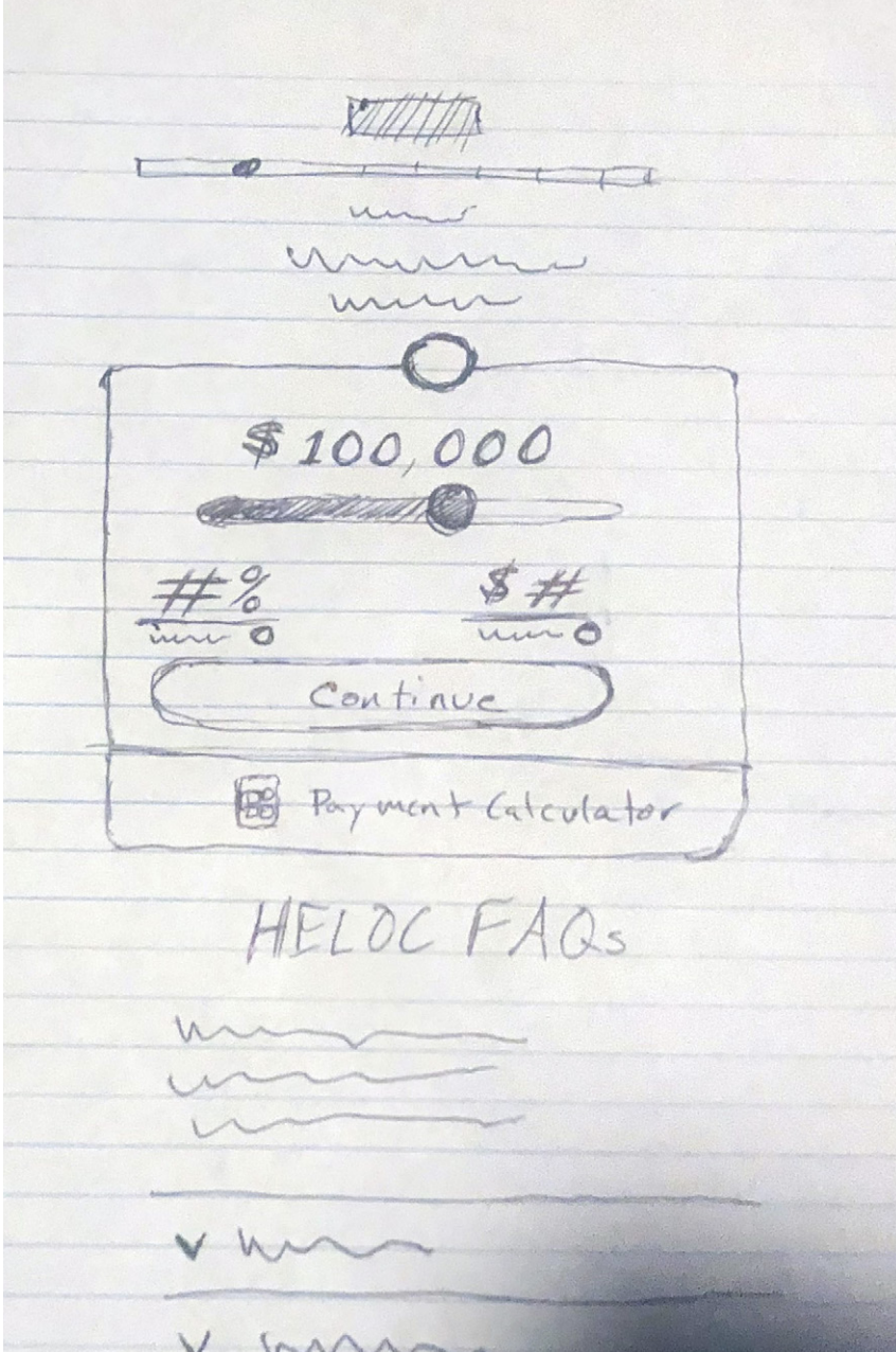
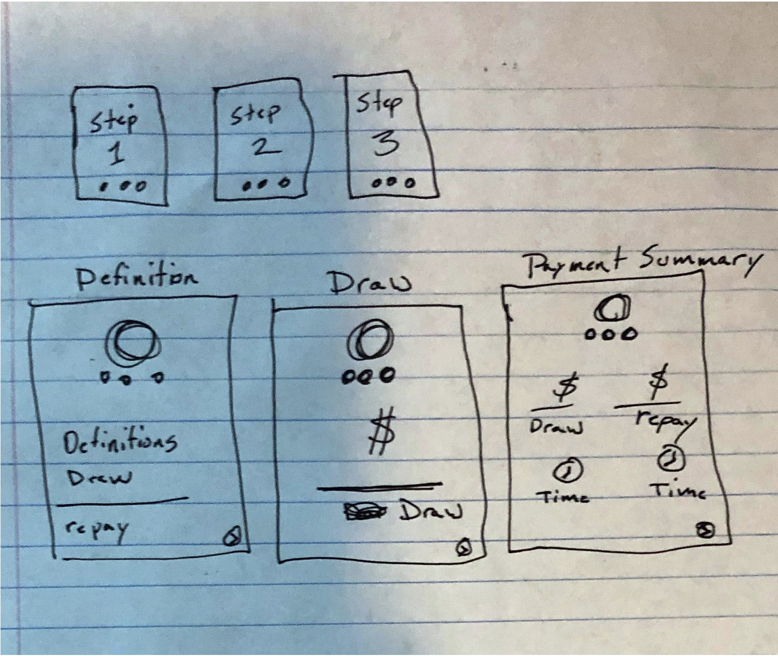
One piece of internal feedback also shaped the final design: a colleague in a design crit flagged that I'd streamlined the offer-picker tool a little too aggressively and stripped out educational cues people still needed. I agreed and added them back — a good reminder that "simpler" and "clearer" aren't always the same thing.
Results
In the retest, users completed the application task without confusion and reported feeling more informed and more trusting of the company
Users could correctly explain the difference between a HELOC and a personal loan after going through the redesigned flow
Shipped an annotated Figma handoff and functional prototype to the dev team, plus stood up daily standups and Slack support through implementation